BASTARDINI
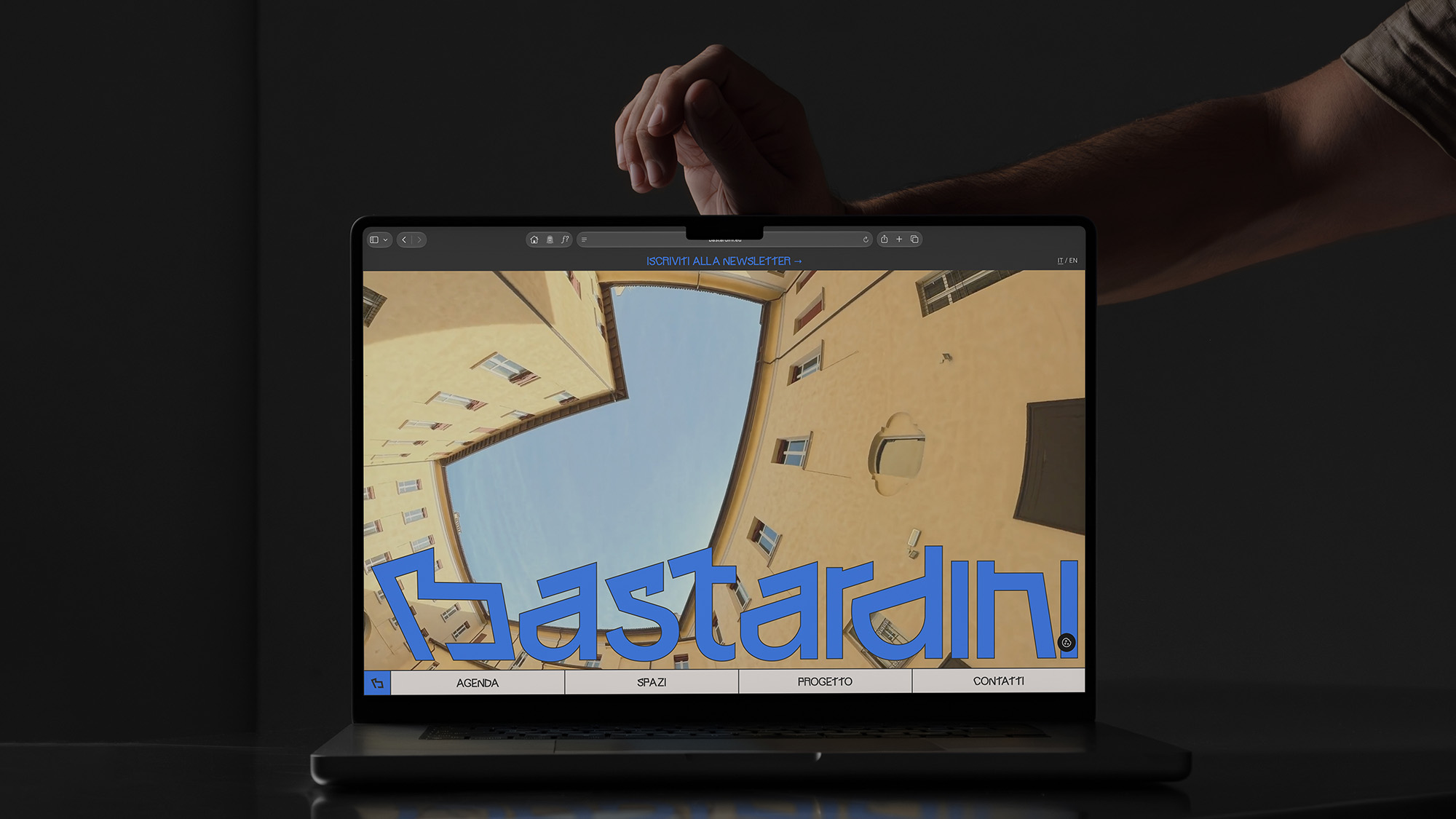
Bastardini’s visual identity draws from the architecture of its historic building, reimagined through a contemporary lens. A modular system combining custom typography, bold geometries and a distinctive colour palette reflects the space’s evolving nature. Photography and video capture the energy of the people and connections that bring it to life.
A dynamic identity bridging history, culture and contemporary urban life.
VISUAL IDENTITY


Bastardini’s creative direction stems from an observation of the historic building that houses it, whose architecture has guided the development of its visual identity.
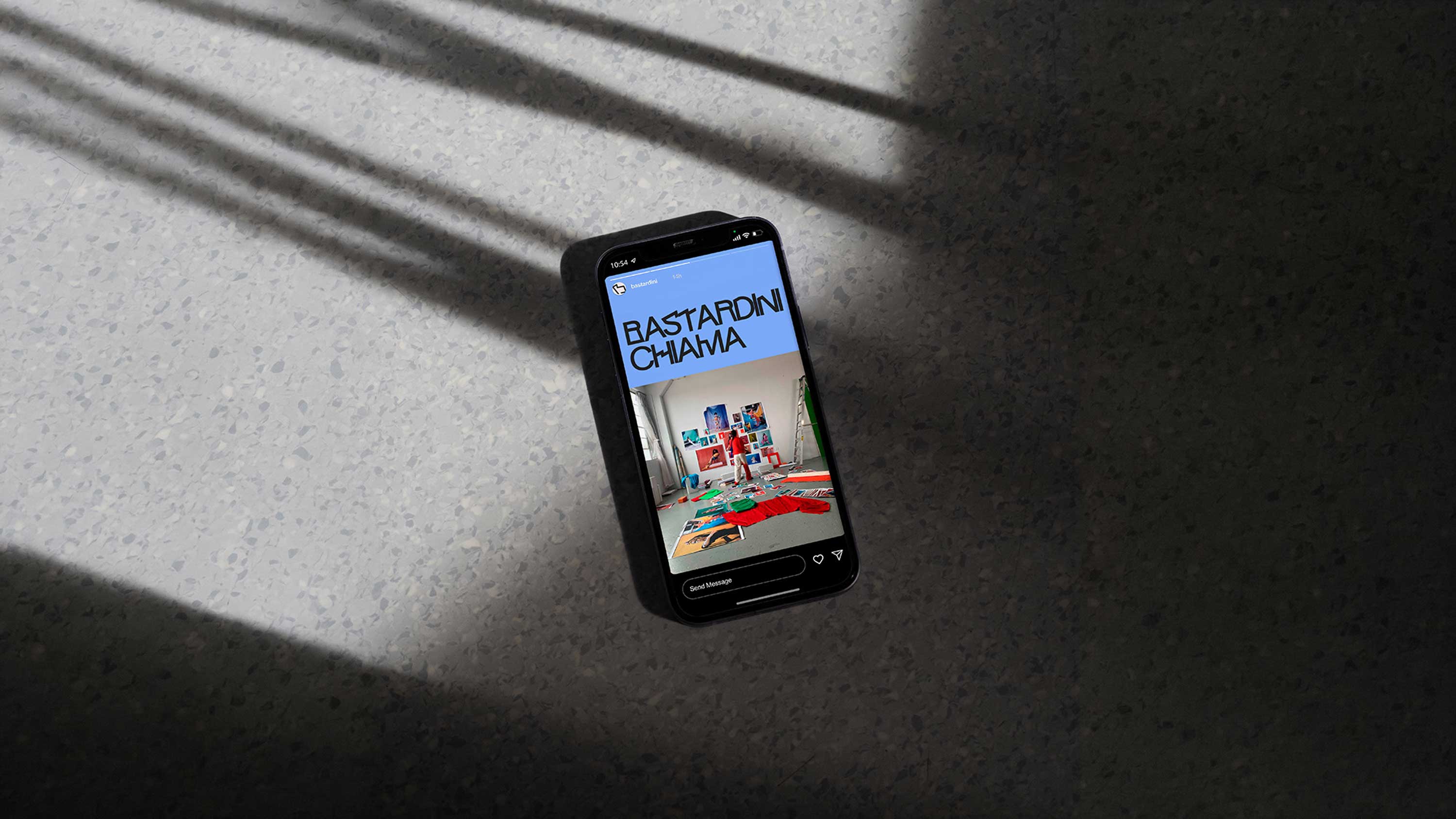
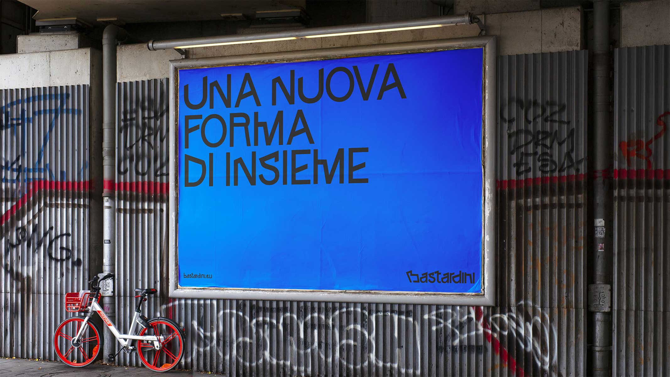
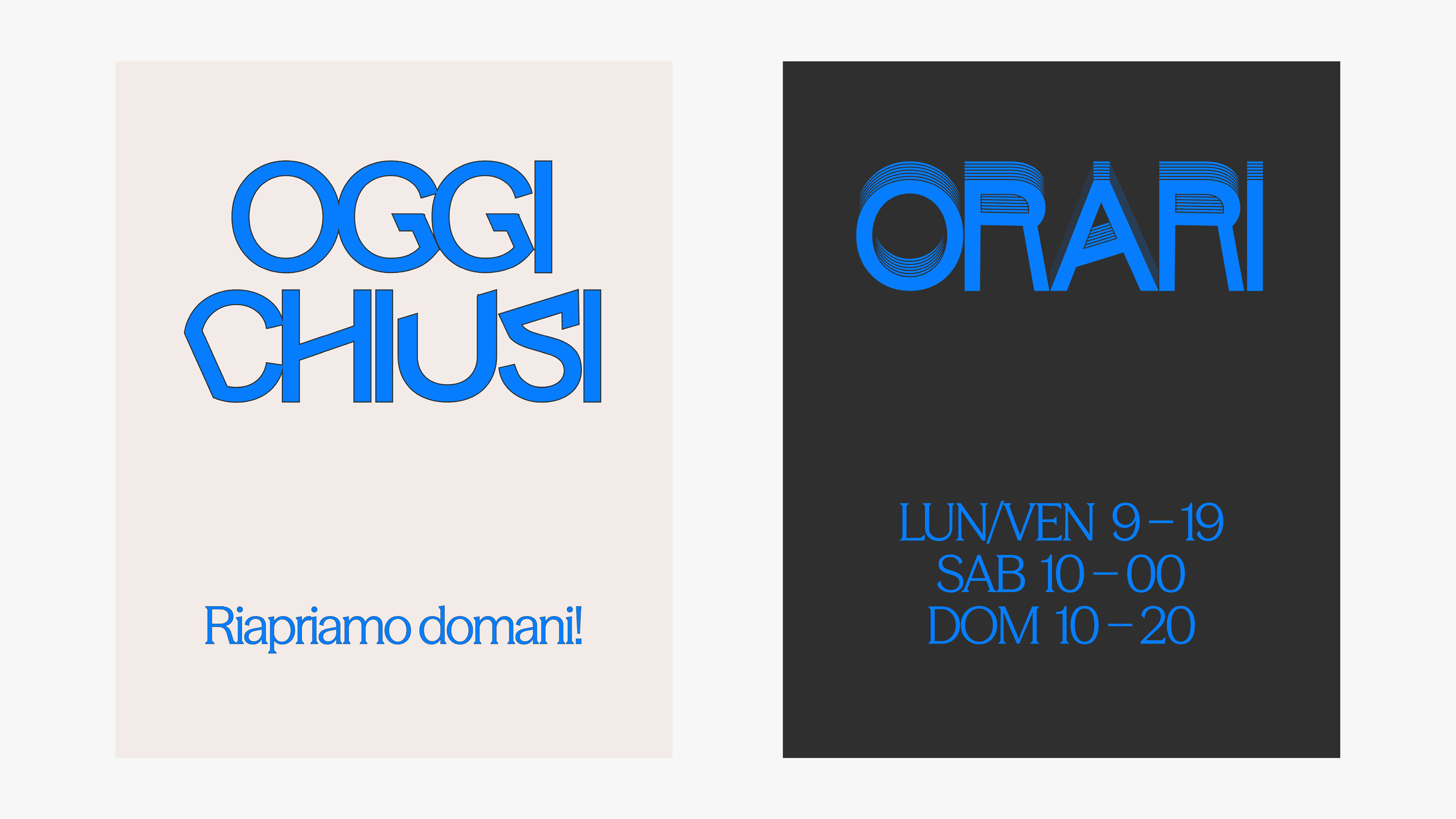
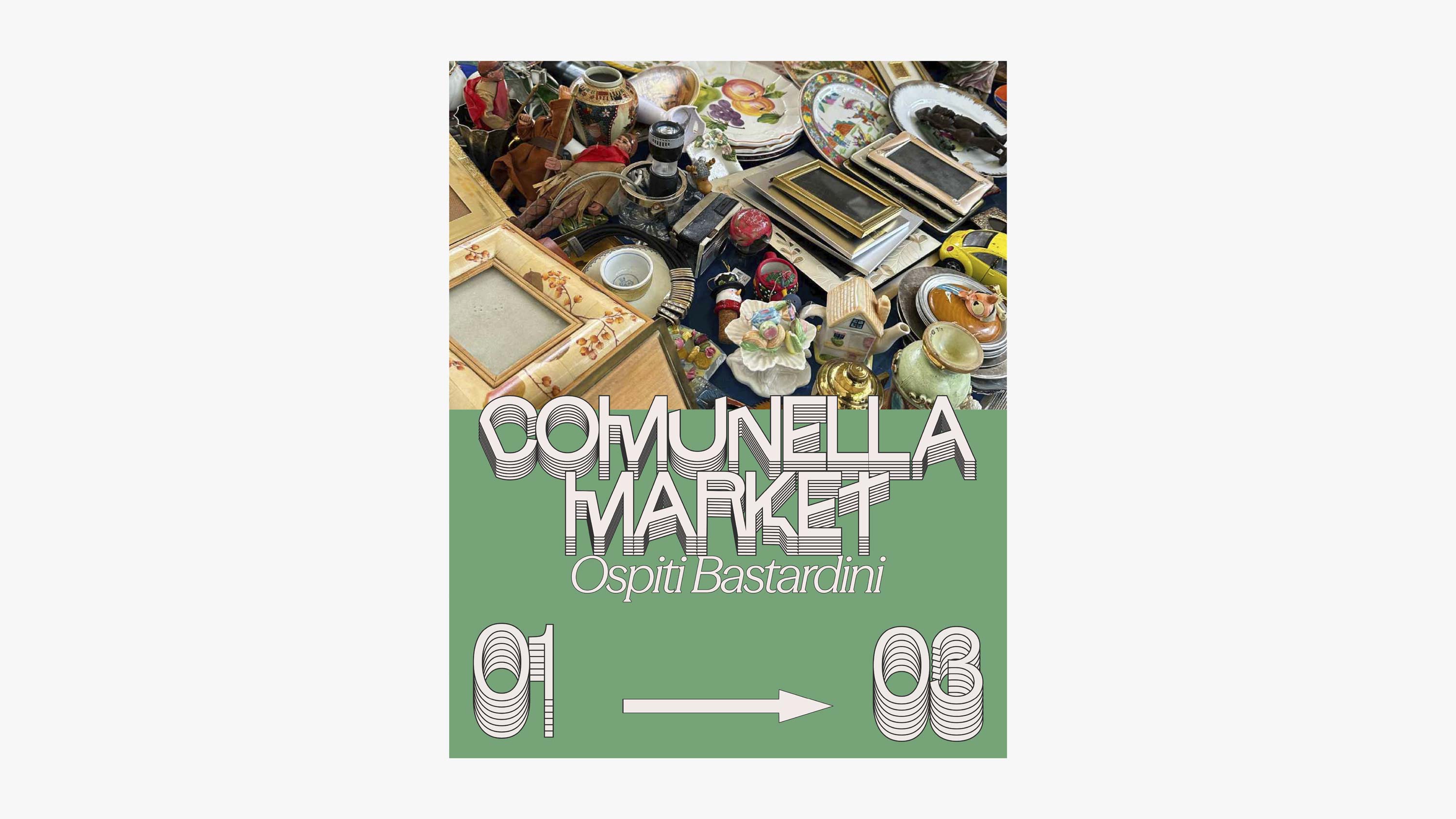
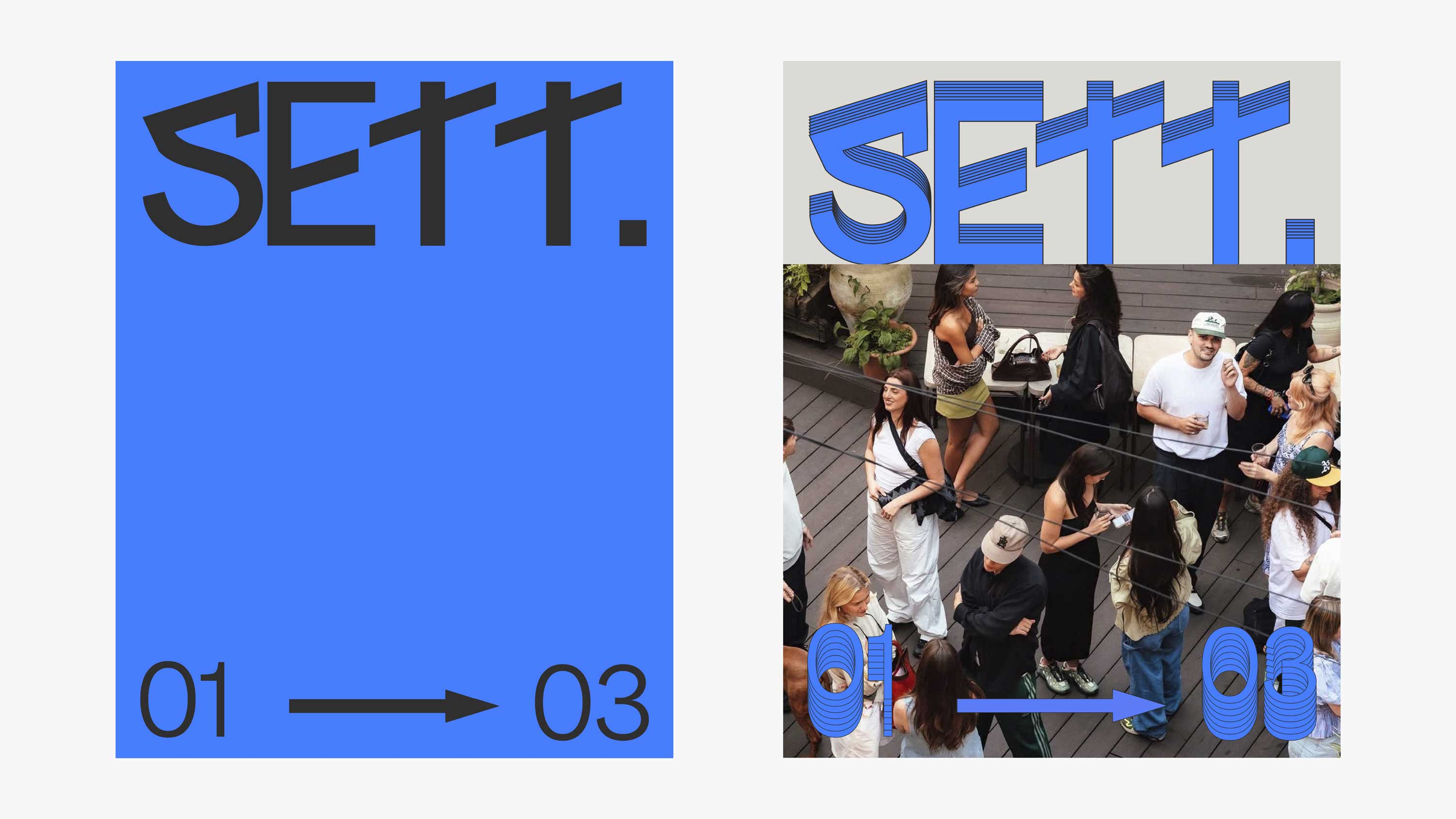
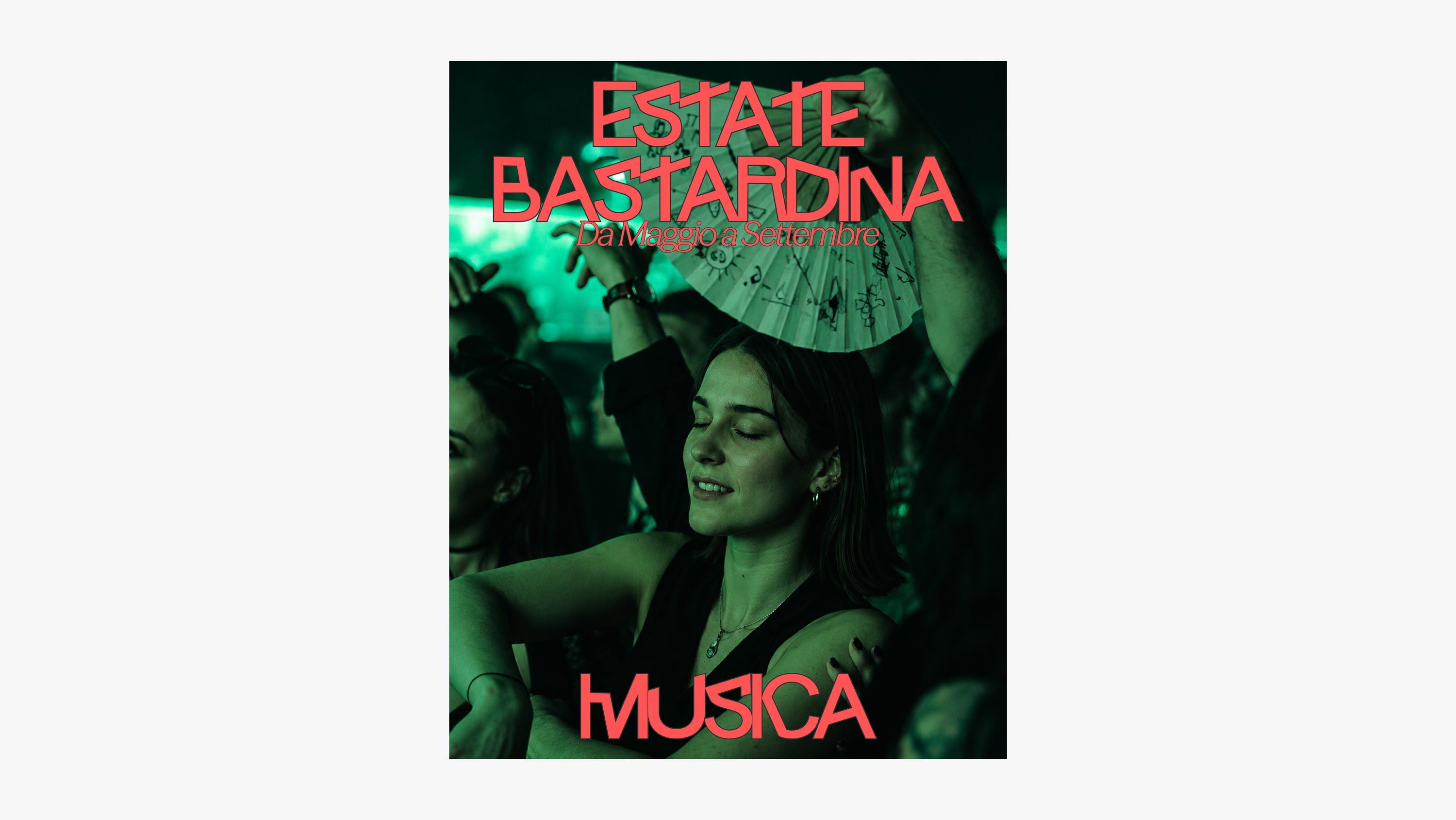
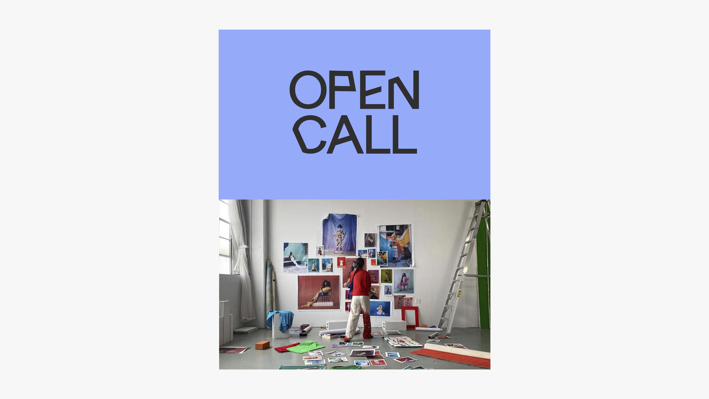
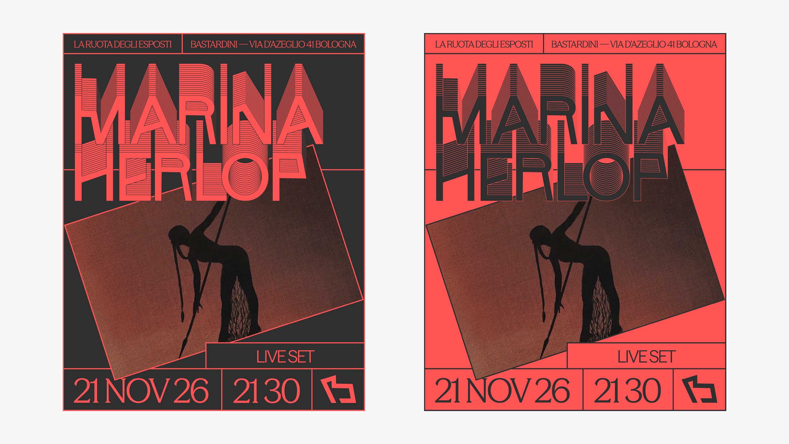
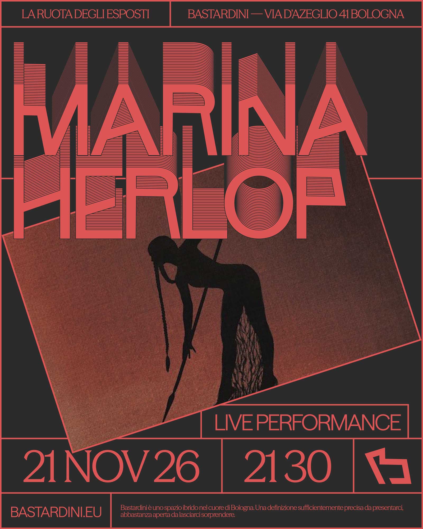
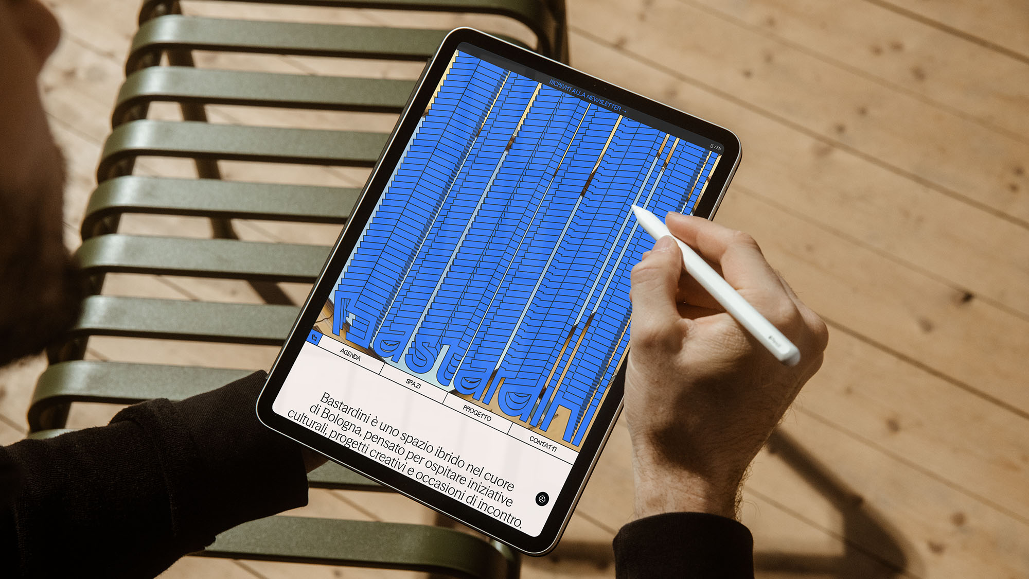
The complex’s ambition to become an urban hub, together with its distinctive formal features, inspired a modular identity system designed to adapt to different content and contexts. The rigour of its architectural geometries is reinterpreted through a contemporary lens in the pictogram, logotype, and an original typeface designed specifically for the brand. The colour system differentiates the various activity categories, while photography and video capture the vitality of the people and relationships that bring the space to life through a spontaneous, documentary-style approach.
The result is a multifaceted identity that balances historical memory with contemporary expression, capable of representing the many different realities of Bastardini without homogenising them.


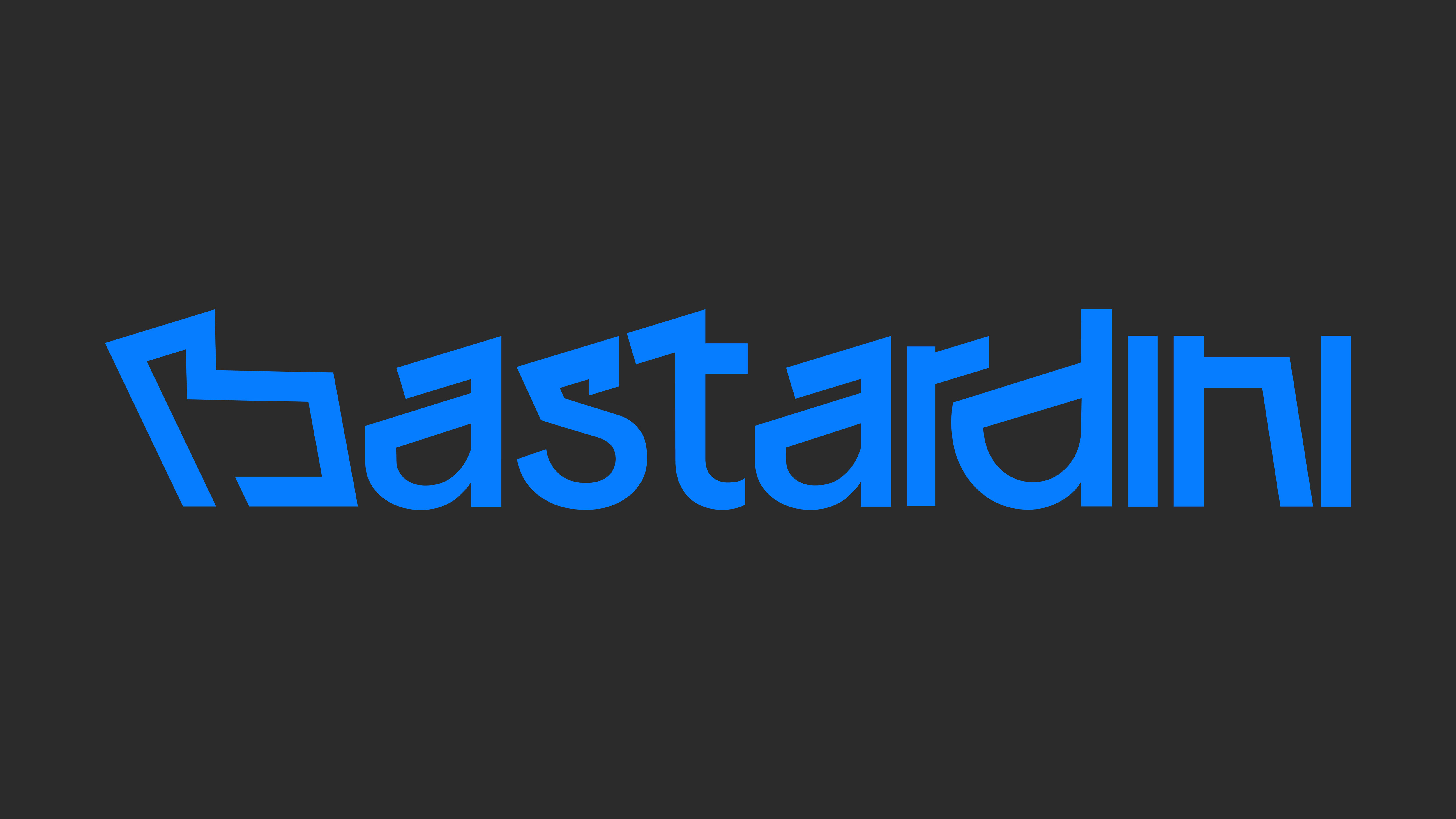
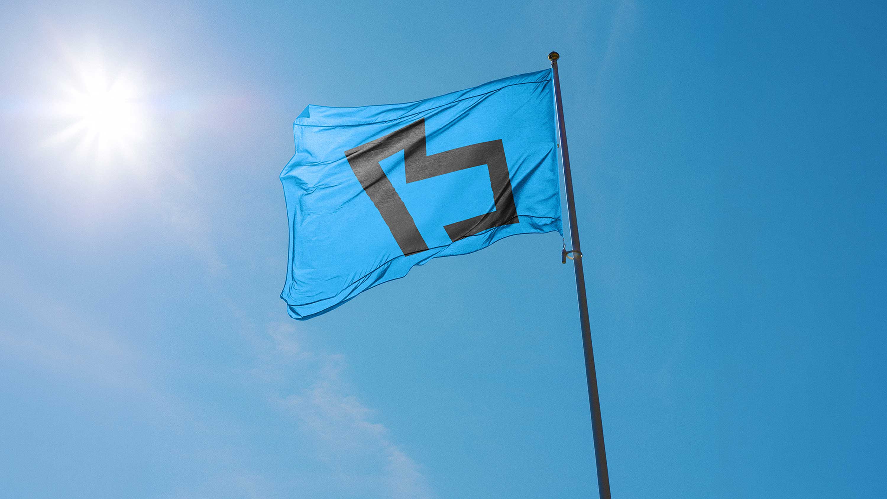
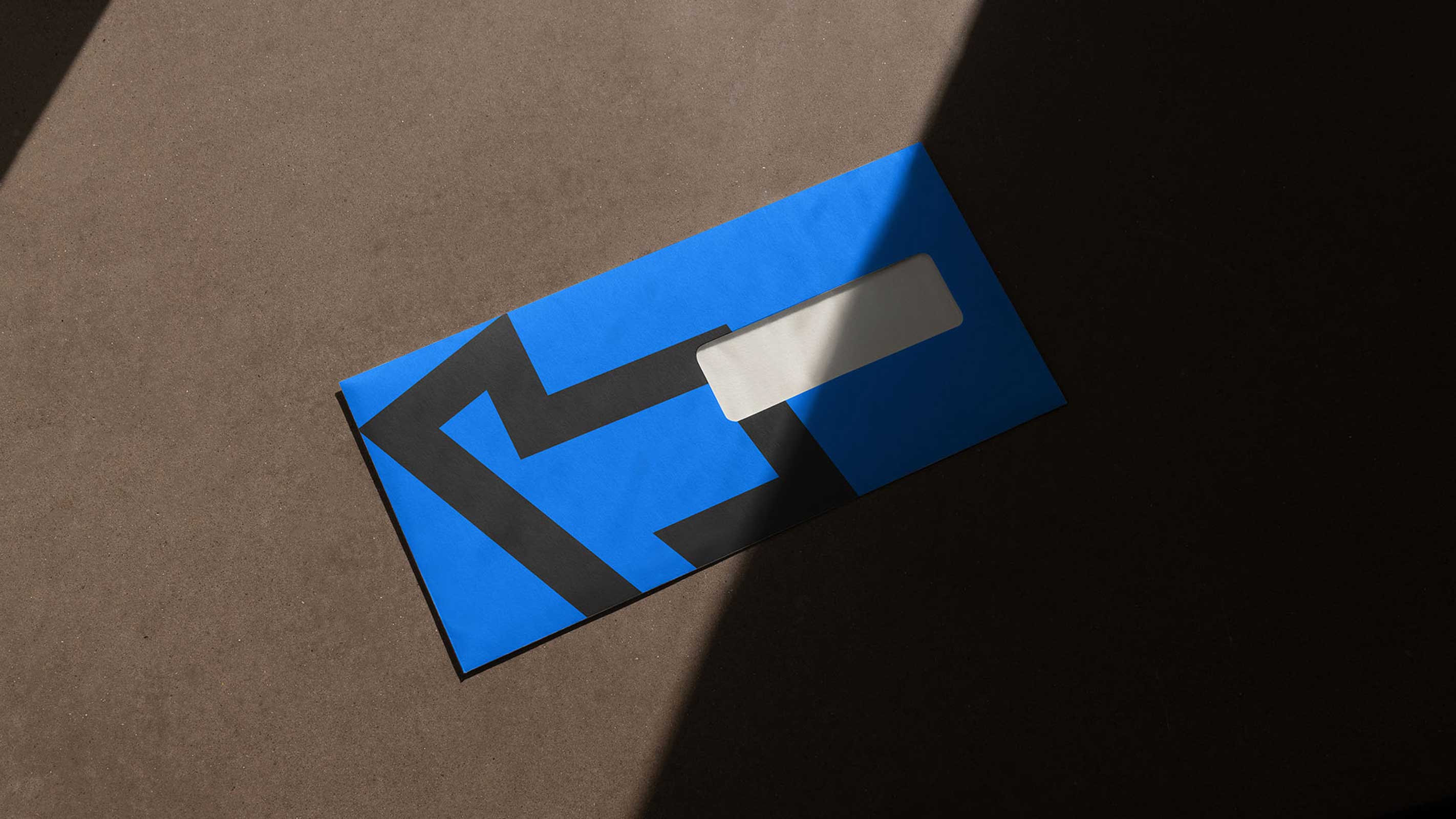
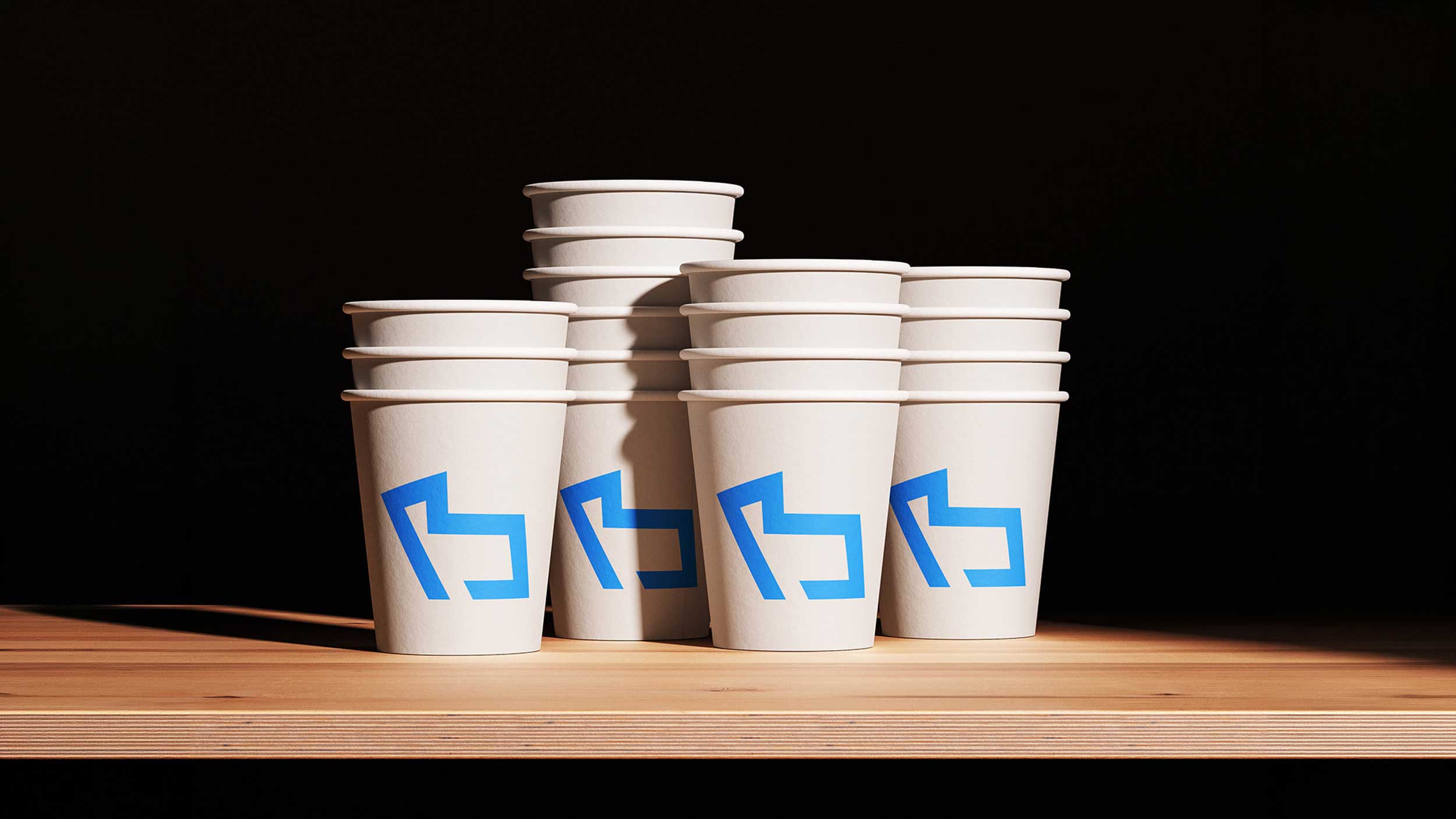
The Bastardini brand mark takes shape from the perimeter of the courtyard, whose geometry evokes the letter “B”. Through a process of synthesis and reinterpretation, the architectural outline is transformed into an essential, recognisable pictogram that retains a direct connection to the identity of the place.
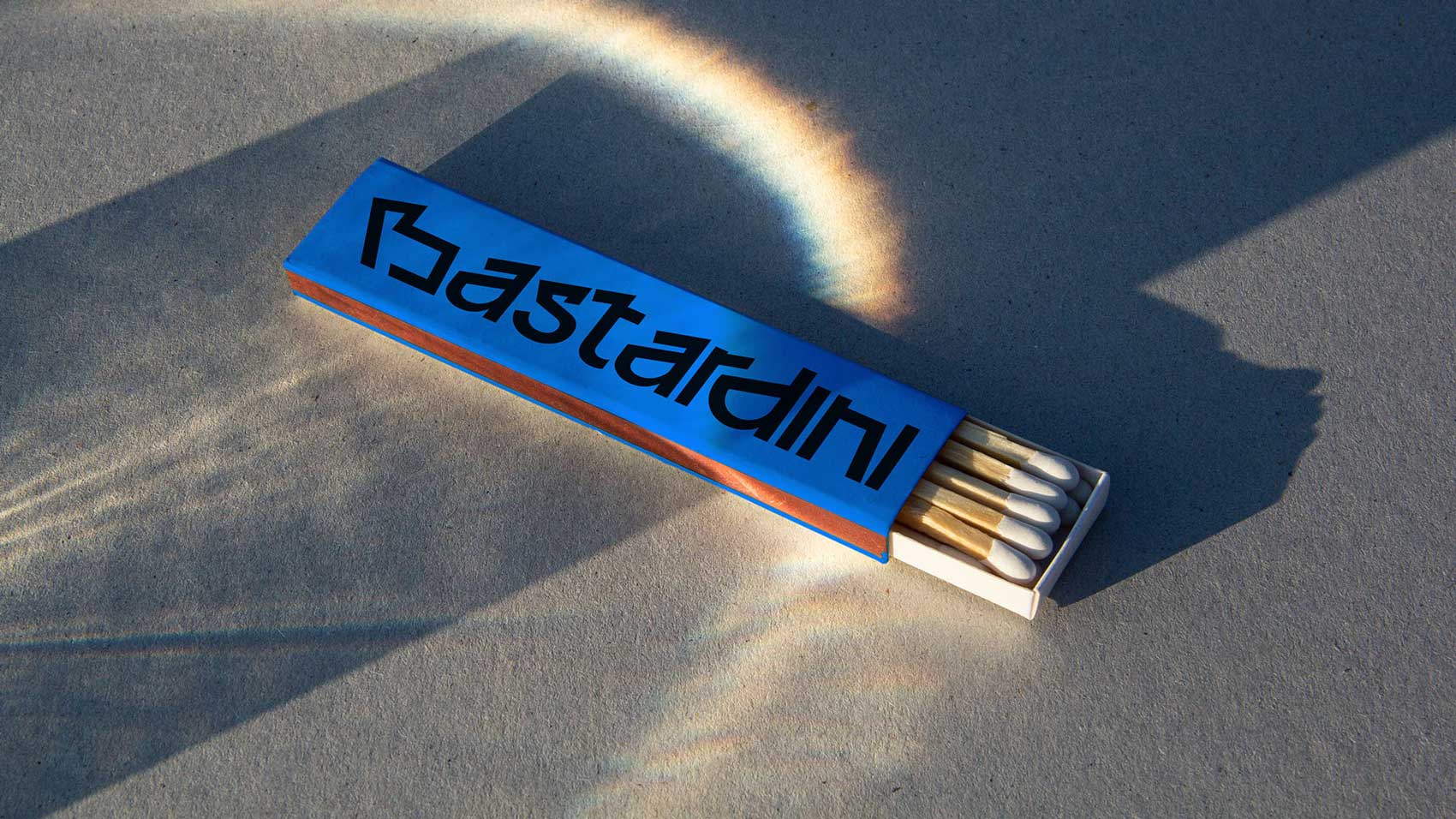
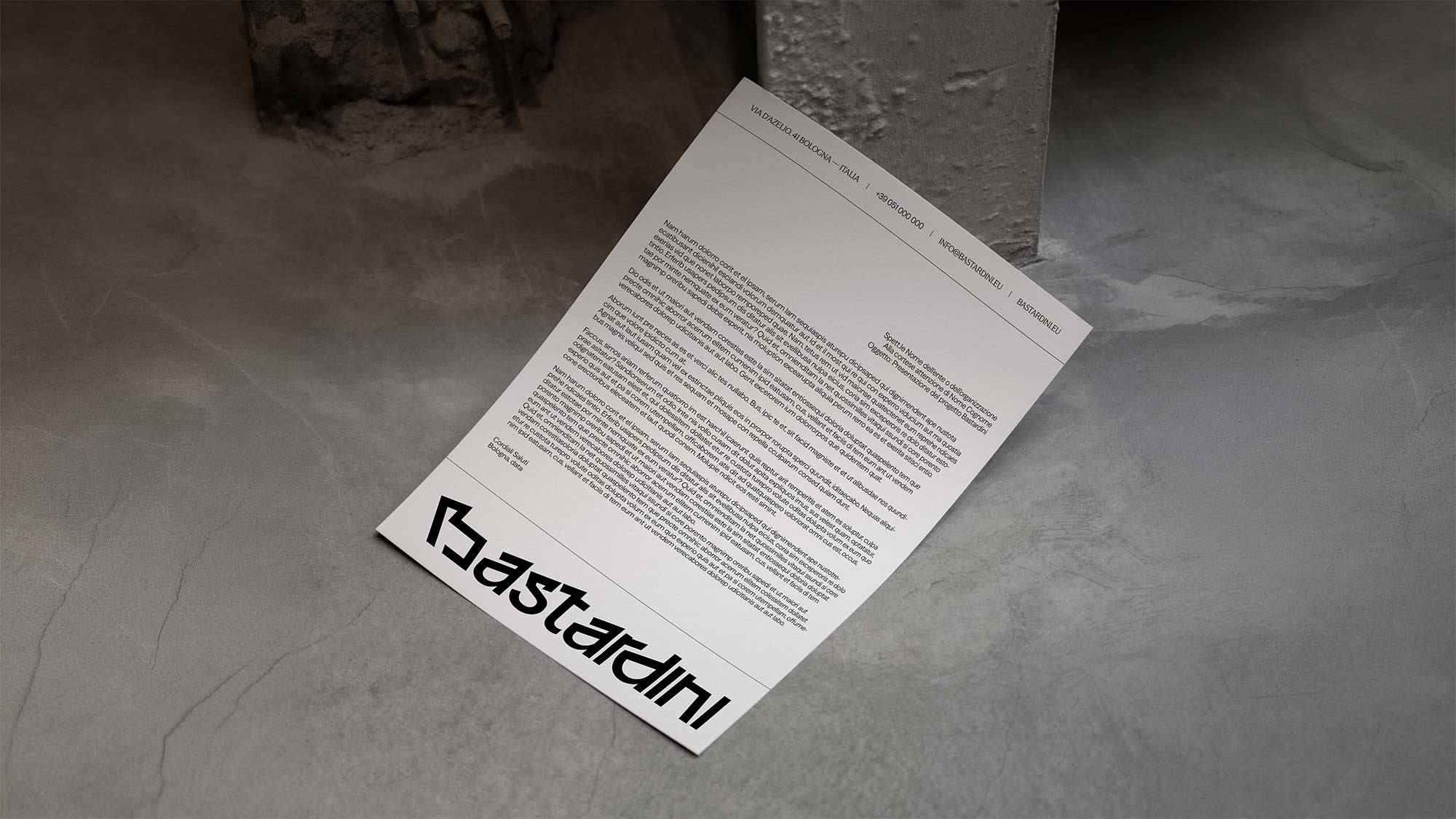
The pictogram’s geometry also informs the construction of the logotype, through the reinterpretation and integration of distinctive elements into the design of the letters. The result is an original typeface in which geometric rigour and contemporary expressiveness coexist.
The pictogram and logotype thus form a coherent whole, grounded in a shared formal language.